Revamping the Heroshe Checkout Experience
Role
Product designer
Category
Responsive Web App
Year
2024
Tools
Figma, Miro, Jira
The Problem
The checkout process is a critical touchpoint for Heroshe. Through user research and customer feedback, we identified key pain points in the checkout process:
Challenges Identified
Checkout took longer than expected, leading to frustration.
Customers were confused about managing multiple shipments, freight methods, and delivery preferences.
The process led to duplicate orders when users navigated back to previous steps.
Customers wanted the ability to change their delivery method after shipment arrival.
At Heroshe, we aimed to reduce friction and enhance user control in the checkout journey, ensuring that customers could complete their transactions within 90 seconds while maintaining clarity and flexibility.
🔎 User Insight: Many users assumed checkout was final and didn't expect to go back to make changes, leading to errors and support tickets.
Impact Achieved
By addressing key pain points in the checkout experience, this redesign led to significant improvements:
Checkout completion time reduced to ~90 seconds, enhancing efficiency.
30% fewer support requests related to shipment changes and duplicate orders.
Higher user satisfaction, with clearer navigation and flexible shipment management.
Improved clarity in delivery preferences, reducing confusion and errors.
Understanding the Users
Our checkout revamp focused on two key user groups: Speed-Focused Shoppers and Shipment Managers. Speed-focused shoppers, including busy individuals and new users, needed a fast, frictionless experience with clear messaging to avoid confusion.
Shipment managers, such as small business owners handling multiple orders, required better shipment grouping, flexible delivery options, and easy modifications post-checkout.
By addressing these needs, we designed a checkout flow that is simpler, faster, and more intuitive for all users.
“🎯 Design Goal: Enable customers to check out in 90 seconds or less while providing flexibility to manage shipments without confusion.”
My Design Process
Research & Analysis
To enhance the checkout experience, I conducted a customer touchpoint mapping exercise and analysed user data to identify key pain points. By reviewing customer interactions, feedback, and behavioural patterns, I gained valuable insights into areas where users faced friction. This data-driven approach informed my design decisions, ensuring that the revamped checkout flow directly addressed customer needs and streamlined their journey.
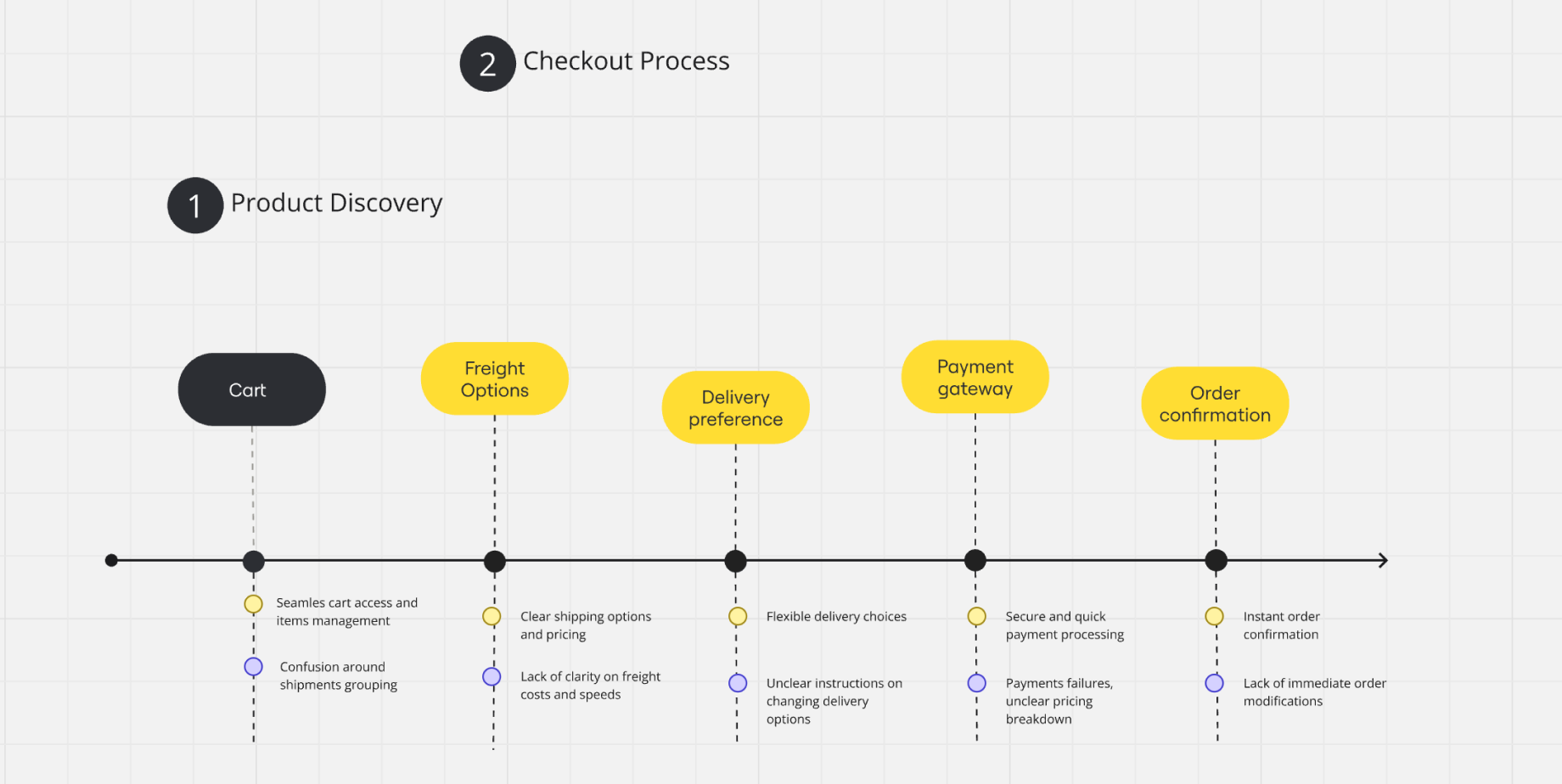
Customer Touchpoint Map
Wireframing & Ideation
With insights in hand, I explored multiple low-fidelity wireframes to streamline the checkout flow.
Explored variations of how users could manage shipments within the cart.
Tested different layouts to prioritise key actions (e.g., adding freight methods, delivery preferences).
Ensured intuitive navigation to prevent users from creating duplicate orders.
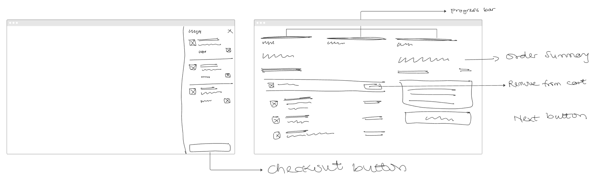
Low-fi wireframe
Visuals & Design Decisions
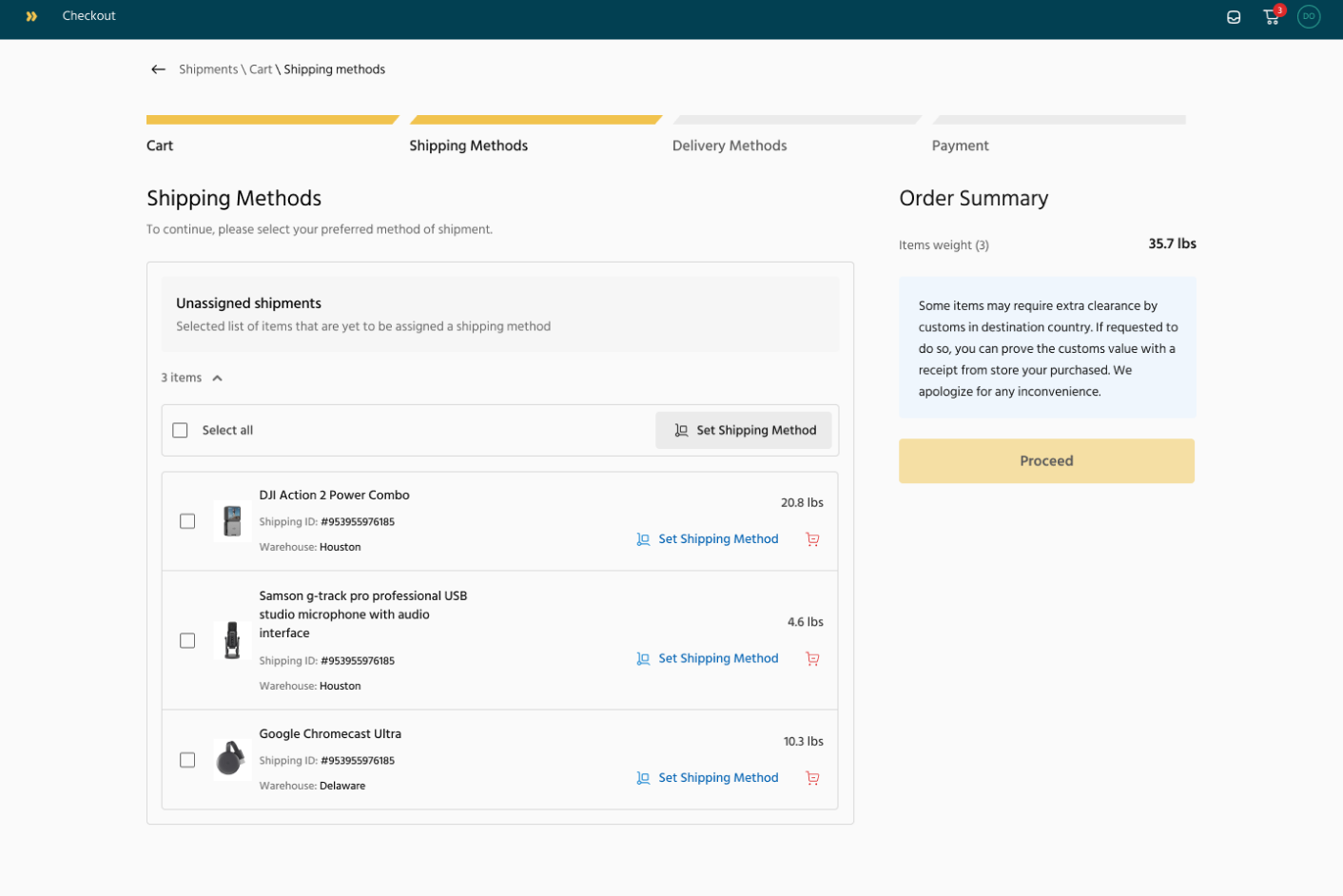
Optimized checkout flow for speed and clarity.
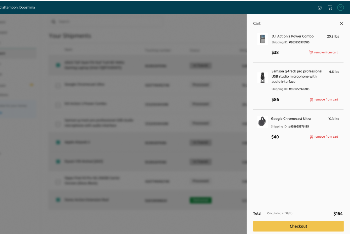
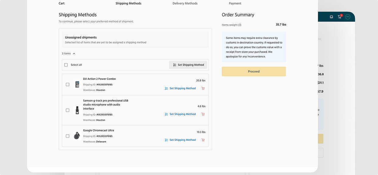
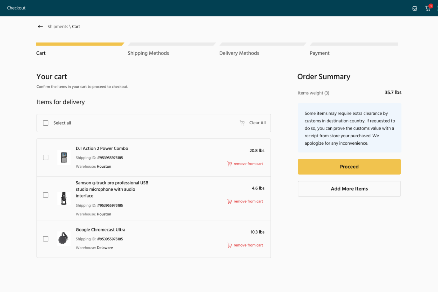
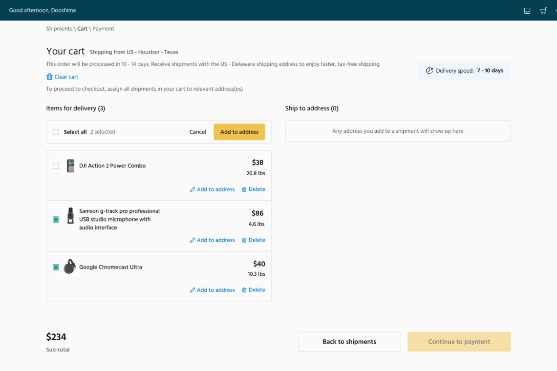
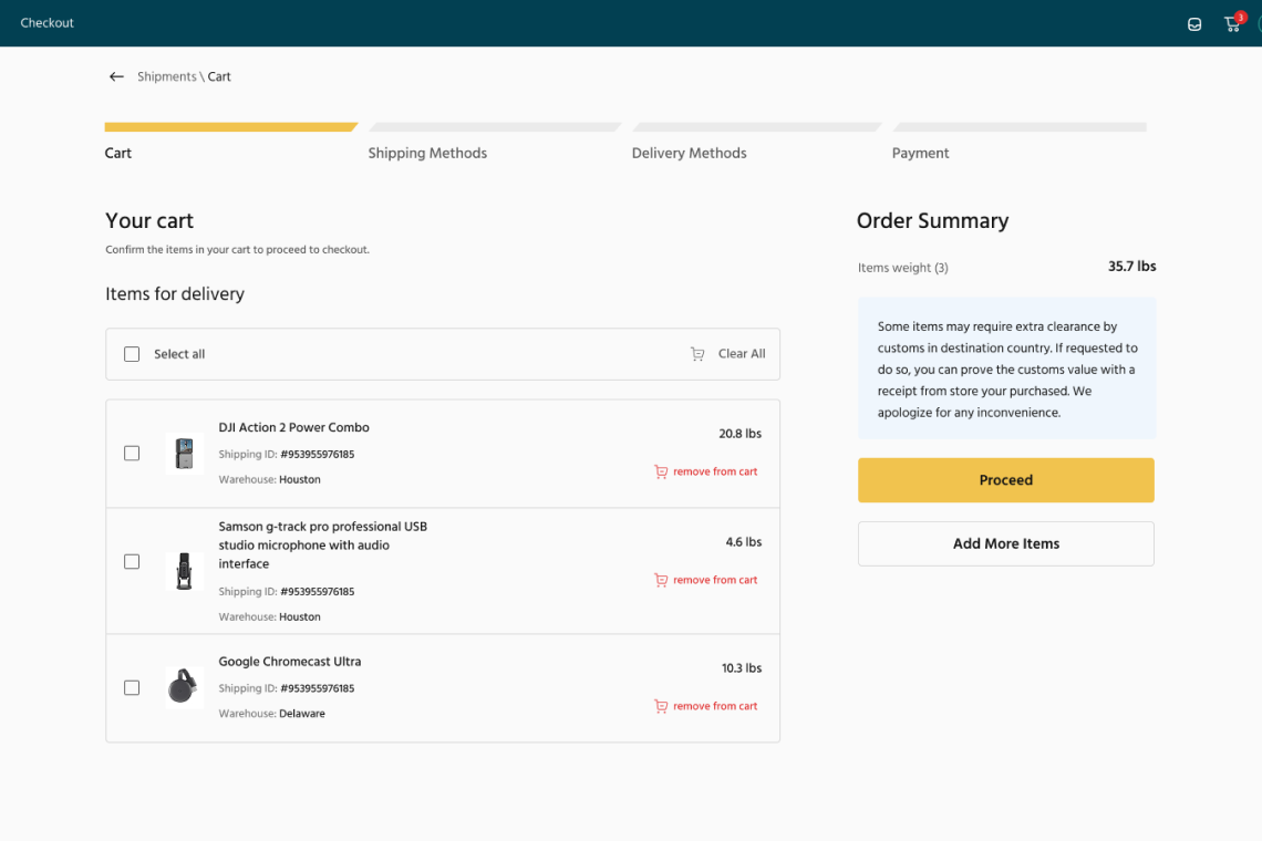
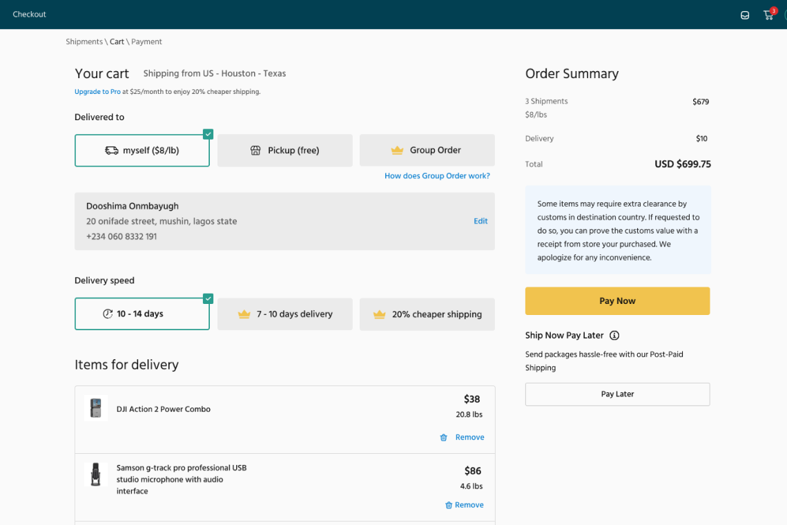
To enhance accessibility and efficiency, the cart is now accessible directly from the top navigation, opening as a drawer for quick interactions. Users can conveniently remove shipments directly from the cart without disrupting their browsing or checkout flow.
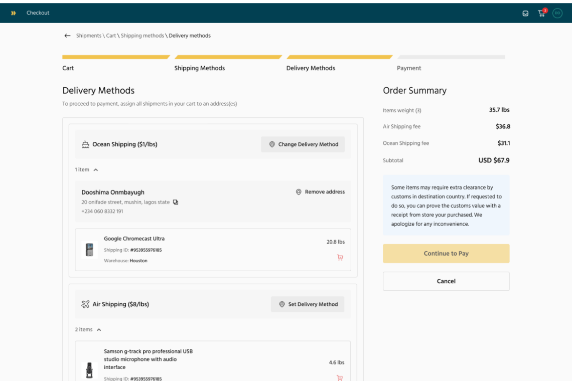
The delivery method screen was enhanced to offer flexible changes post-checkout while ensuring users understand the implications of their choices.
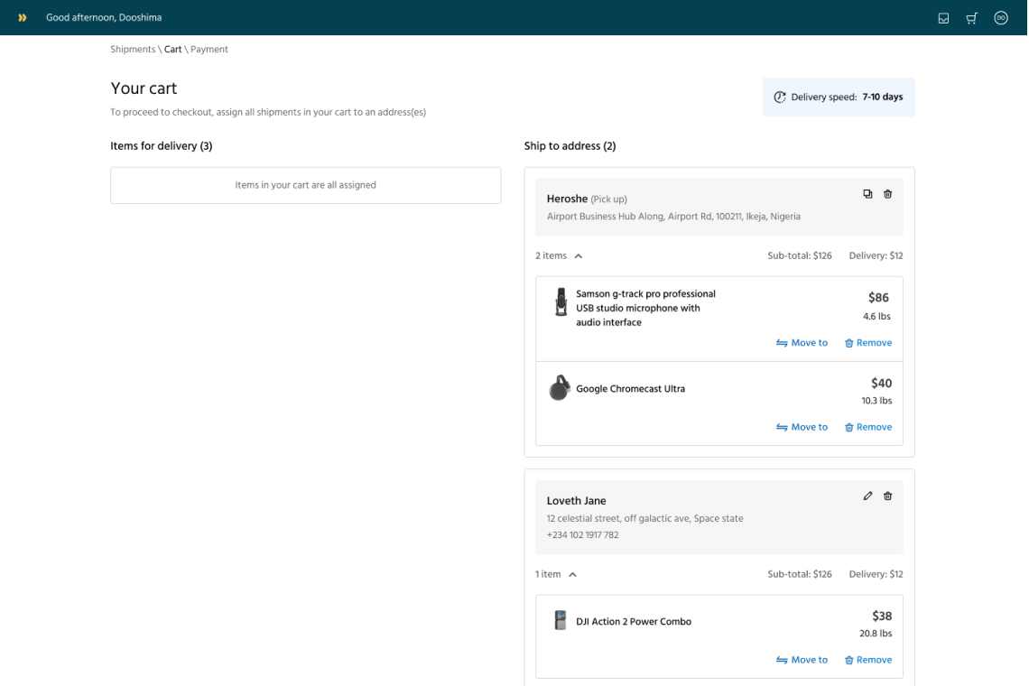
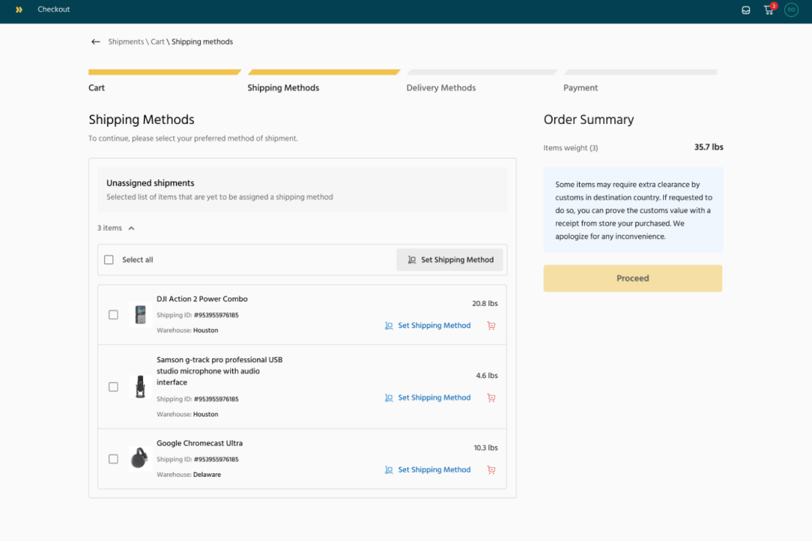
Smart shipment grouping: Apply freight and delivery preferences to multiple shipments or just one.
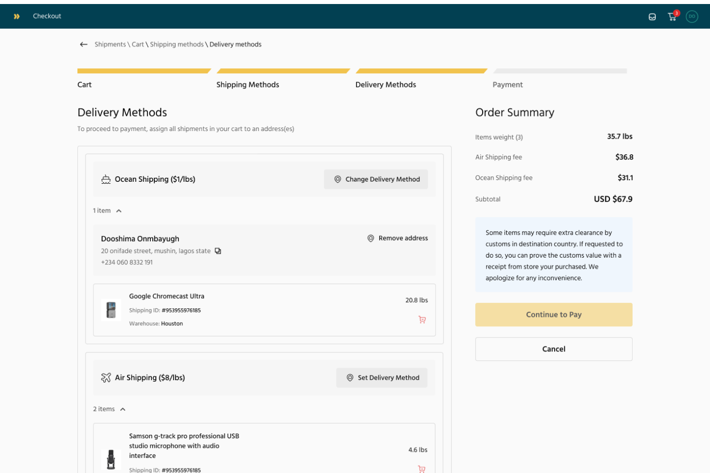
Users can now select their preferred shipping method more intuitively, with clearer distinctions between available options and estimated delivery times.
The delivery method screen was enhanced to offer flexible changes post-checkout while ensuring users understand the implications of their choices.
Clearer messaging: Users now receive actionable feedback to guide their next steps.
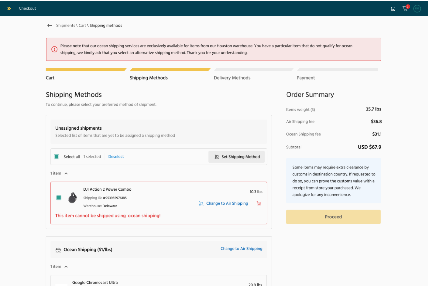
Users receive clear guidance on next steps, whether it's a failed payment, missing shipping details, or an invalid selection.
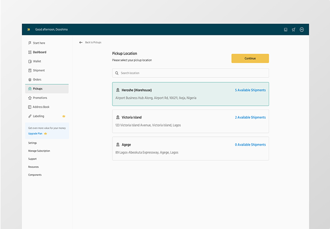
Pre-selected Heroshe pickup address: Reducing manual errors.
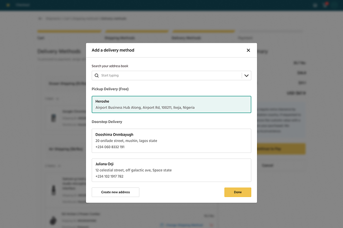
Users receive clear guidance on their delivery options, this design streamlines the process, reducing manual errors and providing users with control over their delivery preferences while ensuring clarity and ease of use.
Before & After Design
Outcomes
Metrics & Success Indicators:
Checkout completion time reduced to ~90 seconds.
30% decrease in support requests related to shipment changes and order duplication.
Higher user satisfaction, as indicated by post-launch surveys.
Upon implementation, usability testing confirmed a smoother checkout experience, with users reporting reduced confusion and increased efficiency in managing shipments.
This project reinforced the importance of clarity, flexibility, and efficiency in product design. By listening to user pain points and testing solutions iteratively, we crafted a checkout experience that is fast, intuitive, and frustration-free.
Other Projects