Improving Pickup Scheduling for First-Time Customers
Role
Product designer
Category
Mobile App/ Web App/ Landing Page
Year
2024
Tools
Figma, Notion, Adobe CC, Miro, Slack
Introduction
In a world where personal safety is a growing concern, GuardUp stands as a mobile application designed to empower individuals in distress, especially abuse victims. It provides a discreet yet reliable way to access emergency services, connect with support specialists, and engage with a community committed to safety. The app is built to prioritize privacy, security, and user trust—key factors in handling sensitive situations.
Key Questions
As we embarked on building GuardUp, we faced several challenges that needed to be addressed:
How can we help users report and manage abuse cases discreetly, without risking their safety?
What features can ensure both speed and security when users are in distress?
How do we build trust with users who need to rely on verified support professionals?
How can the community contribute to a collective effort in safety?
Understanding the Users
To understand our users deeply, we focused on the core challenges they face:
Victims in distress: Often afraid to reach out, users needed a safe and quick way to access help.
Support specialists: Case managers, including legal counselors and mental health workers, required a system that allowed for easy tracking and scheduling of support sessions.
We knew that users didn’t just need an app; they needed a lifeline.
Discovery & Ideation
In the Discovery phase, I focused on understanding the unique challenges faced by users, especially individuals in distress, and how I could design an intuitive and secure mobile experience that would meet their needs. Through user research, empathy mapping, and persona development, I was able to identify critical pain points and opportunities for design innovation. Here’s what I discovered:
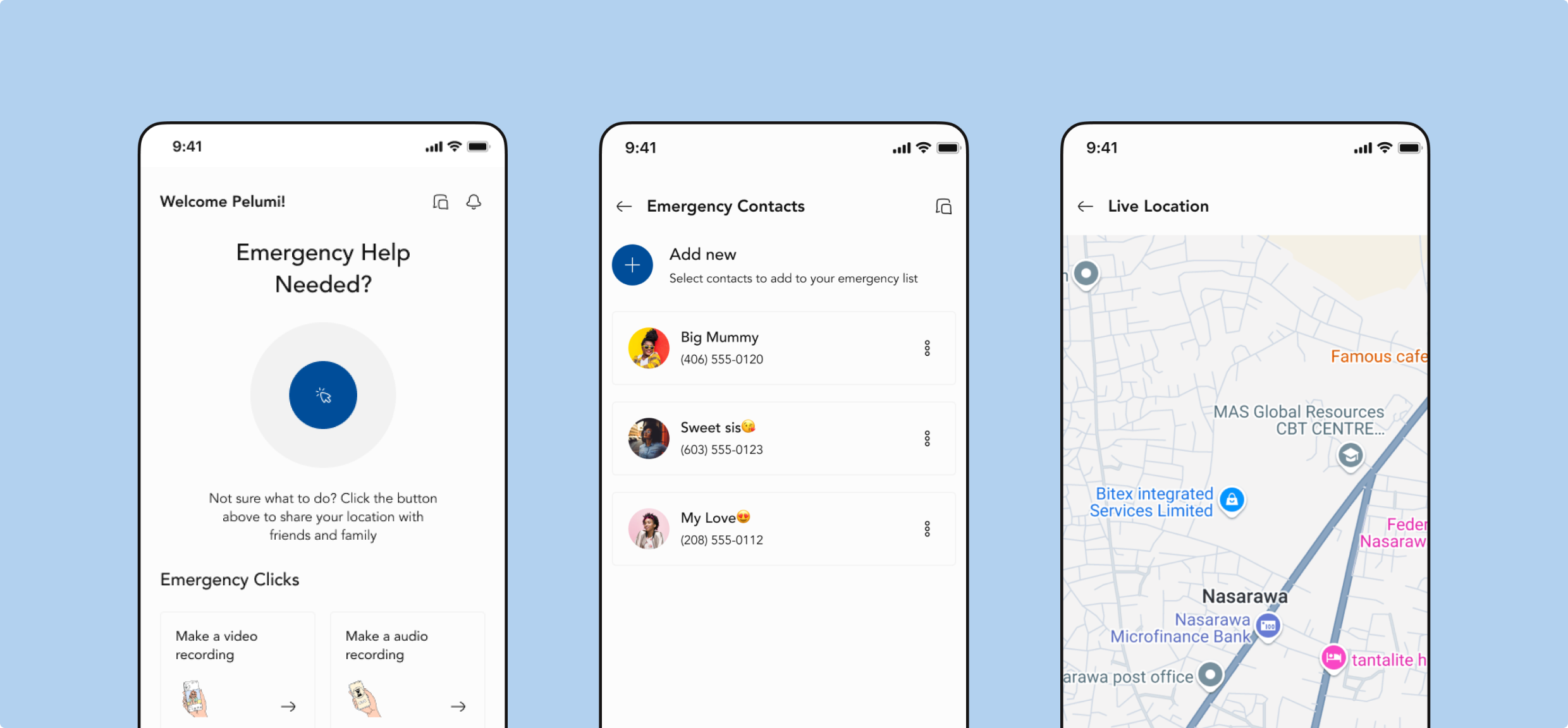
1. Lack of Immediate Access to Help: Victims of abuse or distress often have limited ways to access emergency support, particularly when they're in unsafe environments or unable to make direct calls for help.
Proposed Solution: To address this, I integrated a one-tap emergency SOS feature, allowing users to send an instant distress signal along with their location. Real-time location tracking ensures that help can reach the user quickly, ensuring appropriate support when it’s most needed.
2. Fear of Exposure & Privacy Concerns: Users are often worried about being tracked, exposed, or unable to trust the people they reach out to for help. Privacy and security are crucial in these situations.
Proposed Solution: I focused on designing encrypted messaging, ensuring that sensitive conversations between users and support professionals (case managers) remain private. Additionally, the app offers anonymous interactions, giving users peace of mind that their data is secure and confidential.
3. Complexity in Accessing Support: Many users are unfamiliar with navigating support systems, especially when in distress. The complexity of these systems can overwhelm them, making it harder to seek help.
Proposed Solution: To tackle this challenge, I simplified the user interface by minimizing the number of steps required to report incidents, chat with case managers, or request support. The onboarding flow is clear and intuitive, guiding users through the app’s features, and prioritizing accessibility and ease of use.
4. Lack of Trust in Support Professionals: Victims may hesitate to reach out to support specialists due to concerns about trustworthiness or fear of being judged.
Proposed Solution: I introduced a verification process for all support specialists, reassuring users that they are communicating with licensed and trusted professionals. Support specialists’ credentials and reviews from previous users are made easily accessible, fostering trust and transparency.
Key Features
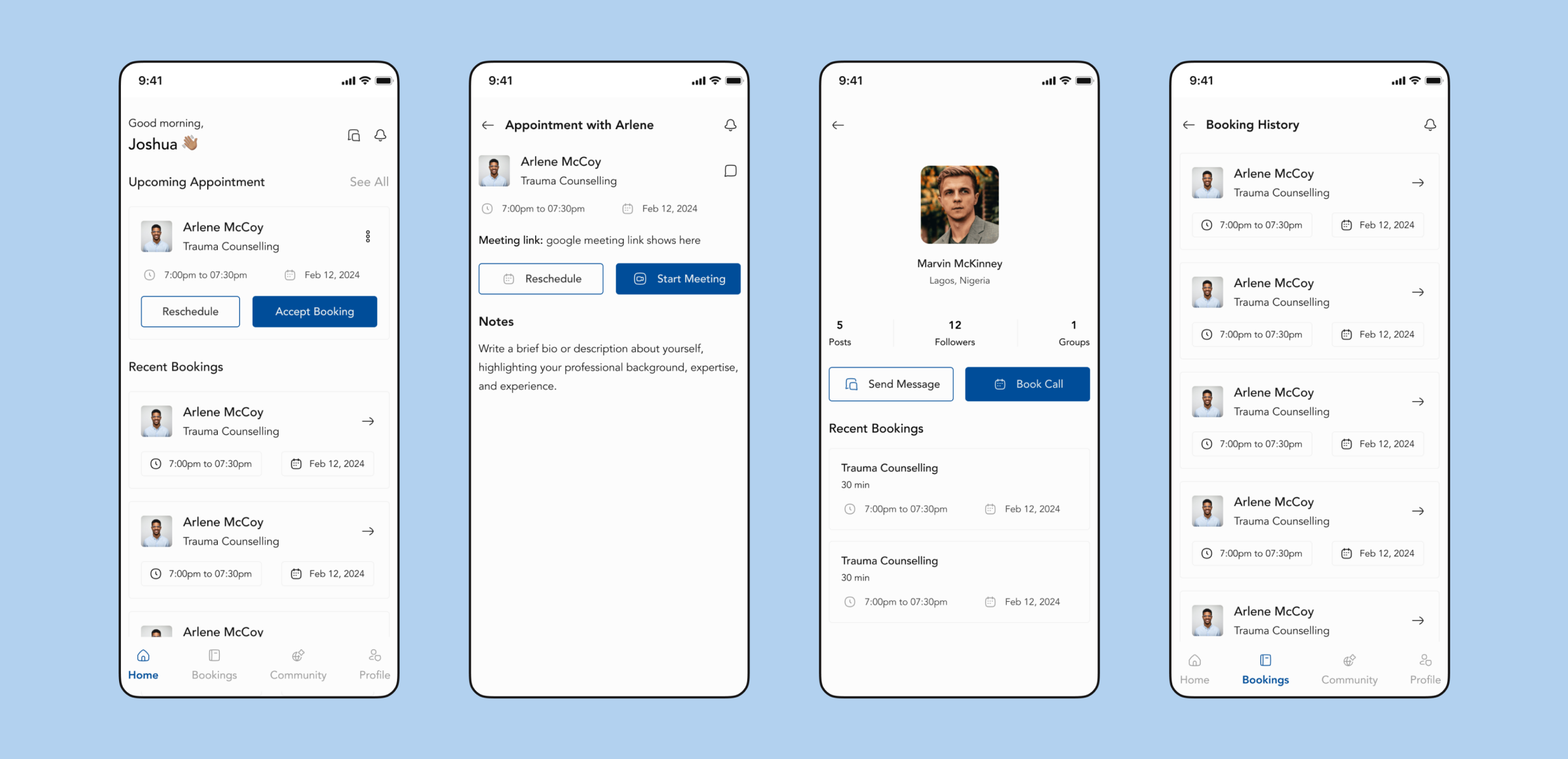
Onboarding & Navigation: The onboarding process is designed to be fast, non-intrusive, and easy to exit. Users can skip optional steps and get immediate access to help features. The interface is minimalist and icon-driven to reduce clutter while guiding users efficiently.
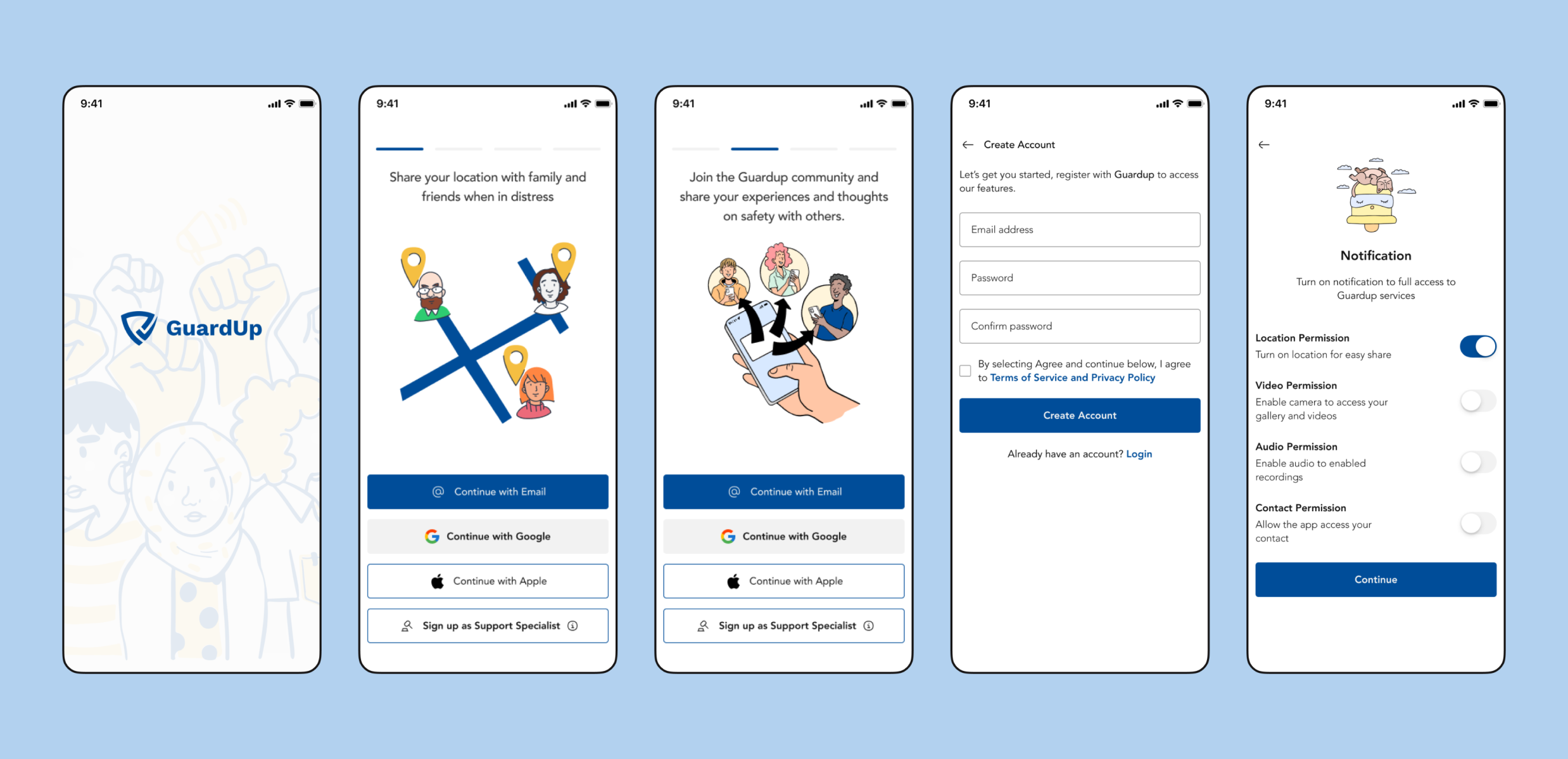
Emergency SOS: A critical feature allowing one-tap distress alerts that silently send an alert with the user's location to emergency contacts or support personnel. The SOS button is discreet and accessible for quick action in high-stress situations, including a disguised mode to activate without drawing attention.
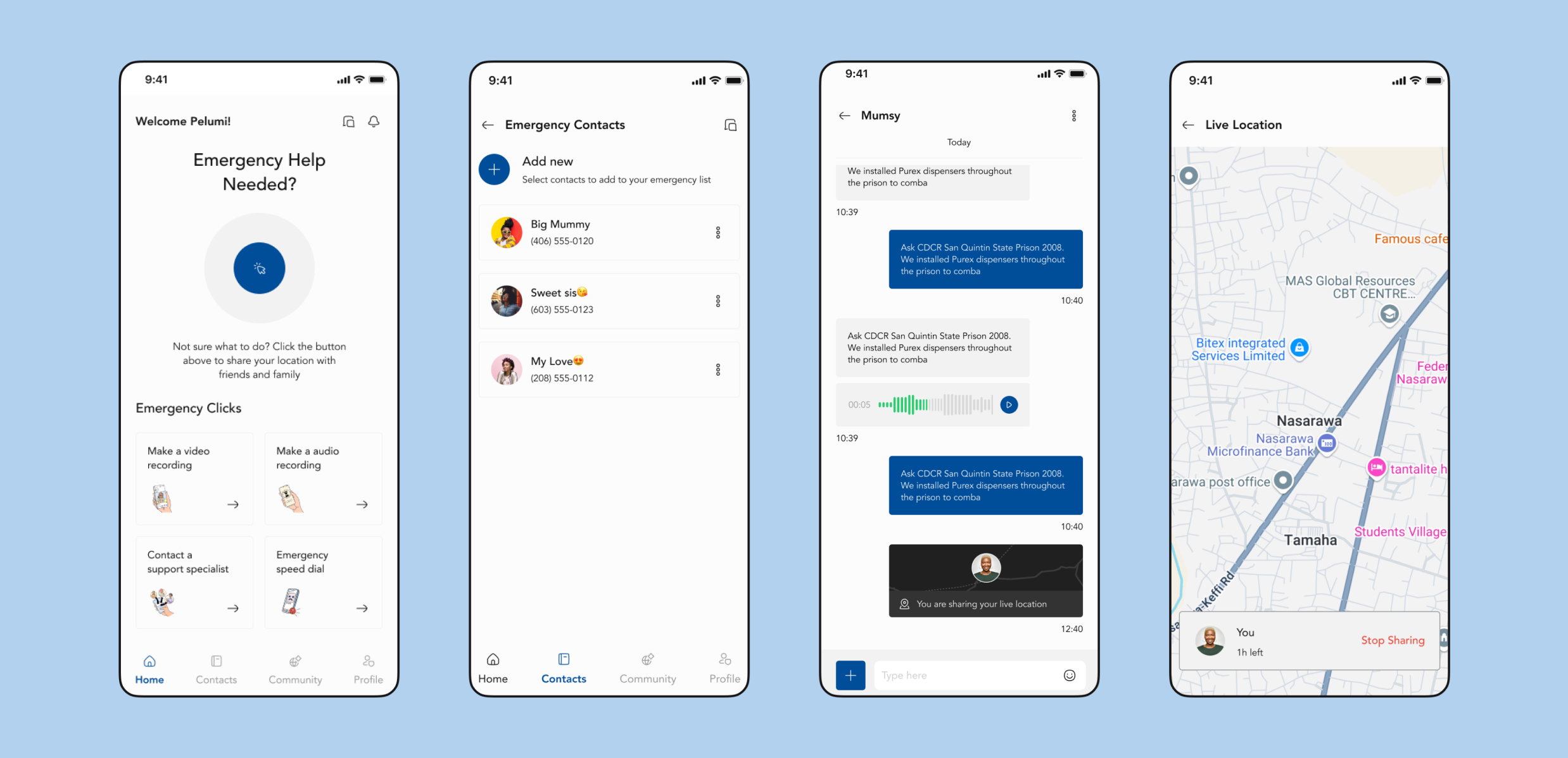
Secure Chat: An end-to-end encrypted messaging system for confidential communication with verified professionals or case managers. The UI is simple and focused, supporting text, voice notes, images, and document attachments, while protecting user privacy.
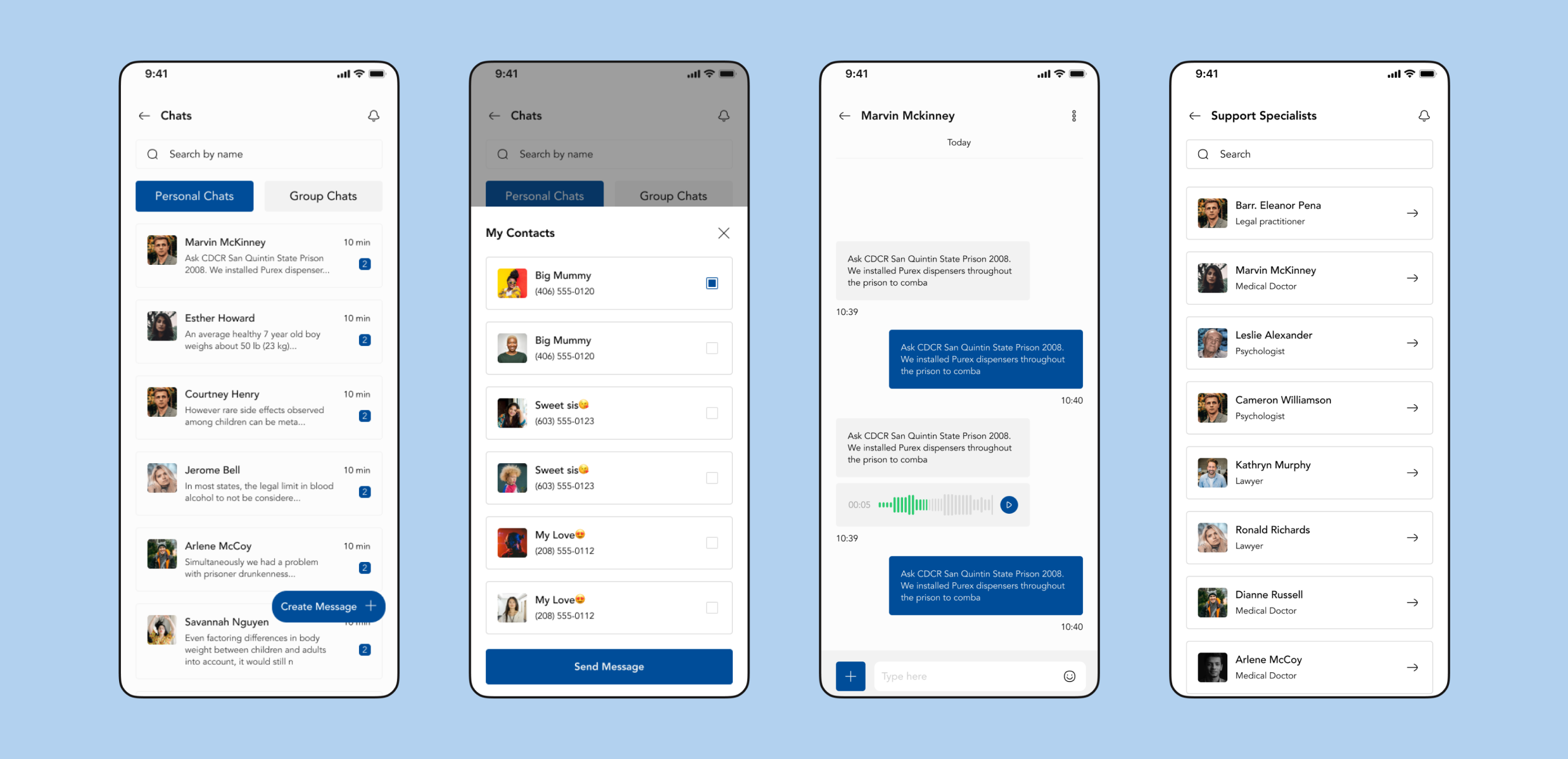
Case Management: Enables both users and professionals to organize support sessions, follow-ups, and progress tracking. Users can manage appointments and view histories, while professionals can access notes, updates, and sync calendars to reduce administrative friction.
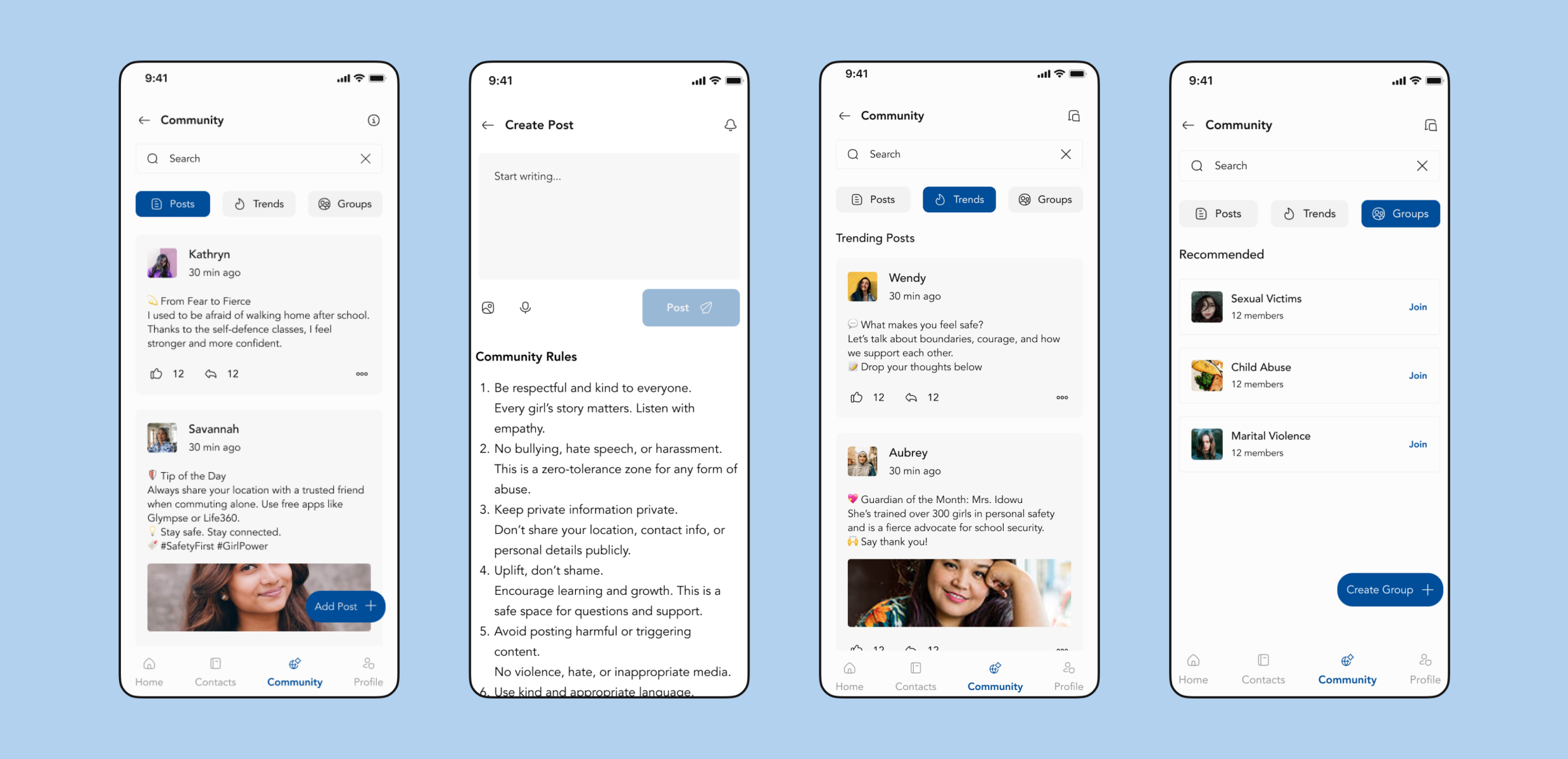
Community Alerts: Users can anonymously report suspicious activity and receive geotagged alerts. This fosters a sense of solidarity and community safety. Posts are moderated and anonymized, supporting responsible and reliable reporting.
Result and Impact
The final product is a seamless blend of functionality and ease of use. Some key outcomes include:
Quick and Easy Access: Users can now reach verified support professionals and share vital information with just a tap.
Empowered Communities: The app fosters a collective safety effort, empowering users to report suspicious activities and help others.
Positive User Feedback: 90% of users in testing found the app easy to navigate, with the emergency features being highly appreciated for their simplicity and speed.
Other Projects